Pantone's 2017 Color Report and Coordinating Caesarstone Surfaces
05/28/2019
3 min read
3 min read
Pantone’s 2017 Color Report and Coordinating Caesarstone Surfaces
Pantone’s Fashion Color Report Spring 2017 has dropped the cotton candy-colored romance of 2016’s Rose Gold and Serenity and has ventured outdoors to embrace the presence of nature. Ten vivid and earthy hues were seen during New York Fashion Week and chosen to drive 2017’s design trends.
These colors surround us in nature and evoke emotions of hope and feelings of transformation, explains Leatrice Eiseman, Executive Director of Pantone Color Institute. Some are playful and energetic like Primrose Yellow and Lapis Blue, while others are tranquil and reflective like Niagara, Island Paradise and Pale Dogwood; some are whimsical like Pink Yarrow, while others give you the urge to hug a tree like Greenery, Kale and Hazelnut. See the Pantone’s 2017 colors here.
Here are some ideas to help you integrate these hot new colors into your home and combine the unexpected with the familiar.

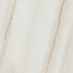
The color Niagara invites feelings of ease and relaxation. This classic denim blue color is in the lead for most popular color for spring 2017, according to Pantone. Whether you paint the interior kitchen cabinets or bring in lamps and other accessories in this muted blue, pair it with the soft creamy, timeless beige of coordinating Caesarstone surface—6616 Cascata.

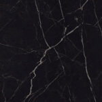
The ever-enthusiastic Lapis Blue is strong and confident. It’s energetic and radiant. The prized semi-precious stone, of which the color is named for, is often used for truth and enlightenment and is historically a stone of royalty. Its rich hue steers clear of boring and livens up the typical navy.
Coordinating Caesarstone surface: 5134 Urban Safari

The color Kale conjures images of a healthy lifestyle and the outdoors. When we’re around it, we feel a deeper connection with the earth, and it can be a solid background for all other nine shades in the palette. This foliage-based green is oxygenating, like taking a fresh breath of air, explains Eiseman. “The world of architecture is also in on the trend given the breadth of vertical gardens, rooftop greenery and leafy plazas cropping up in new commercial buildings from New York to Dubai.”
Coordinating Caesarstone surface: 4044 Raw Concrete

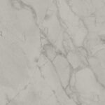
Primrose Yellow is a joyful shade that evokes good cheer and instant warmth. It’s reminiscent of sunny days and flowers as it shines with confidence. By contrast, Island Paradise is a refreshing shade of aqua, a cool blue green tone that helps us unwind. The tropical feel takes us away to the far-off destinations in our minds. Together, they create daydreams that lure your imagination in.
Coordinating Caesarstone surface: 4130 Clamshell

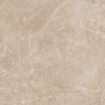
The fiery orange of Flame fills a room with fun-loving energy. It’s vivacious and flamboyant. Make a great statement in your kitchen with a well-lit Flame backsplash paired with 2370 Mocha countertops.
Coordinating Caesarstone surface: 2370 Mocha
{{ subtitle }}
{{ i.desc }}
{{ subtitle }}
{{ subtitle }}