Pantone Color of the Year 2019 - How to Make Your Home Pop
05/30/2019
4 min read
4 min read
Every year, the Pantone Color Institute scours the fashion runway, films in production, trending art and design, and more to forecast the hues that will dominate the following year. Partnering with global brands to leverage the power of color psychology, everything from relevant social media platforms, high-coverage sporting events, new technologies, innovative textiles and textures are influential in Pantone’s design strategy. Each December, expert designers anxiously await this crucial announcement as Pantone’s Color of the Year can be integral to product and brand visual identity. Pantone Color of the Year 2018 gave us Ultra Violet, while the year before brought us Greenery. So, what’s in store for 2019?
Well, the news has dropped. This year’s Pantone Color of the Year is Living Coral (16-456). Technically a “coral hue with a golden undertone,” Living Coral is mellower than red, but a few shades brighter than pink, embodying a sense of warmth, while exuding an energy and playfulness that is both humanizing and heartening in our modern world of cold technology immersion. Further, Pantone’s 2019 hue has environmental impact, drawing attention to our much-threatened subaquatic ecosystem: “Living Coral is evocative of how coral reefs provide shelter to a diverse kaleidoscope of color.”
If you’re wondering about the best way to incorporate coral interior design into your space, Caesarstone is here to help. Pantone’s warm golden-peachy orange is an appealing earthbound shade that welcomes optimism and intimacy, making it applicable to most existing décor color themes. As an accent, Living Coral can bring a bright spot of color to any space. And while bold and vibrant, this shade also radiates the serenity of its underwater origins, making it ideal for painting an entire wall, such as a hallway or in a bathroom. Further embracing the hue of much ado, a coral sofa or oven would be in line with the trending infatuation for statement-making furniture and appliances.
Caesarstone, the pioneer of engineered quartz surfaces, has been setting standards in innovation, design and craftsmanship for more than 30 years, collaborating with renowned designers and architects, then pushing through boundaries to give our customers the latest, most cutting-edge designs. Made from one of earth’s strongest materials, Caesarstone quartz surface collections are the optimal backdrop for your décor design, providing nonporous, scratch and stain resistant durability that ensures low maintenance and long-lasting luster. And some of our designs are created using up to 42% reclaimed quartz via rigorously scrutinized sustainable practices, further augmenting the eco-friendliness that inspired this year’s Pantone shade, Living Coral.
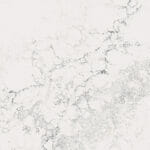
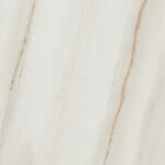
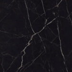
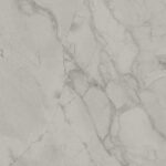
Caesarstone offers a variety of quartz surface styles, colors and textures that can mesh seamlessly with or boldly offset Pantone’s 2019 Living Coral hue.
Curated for beauty and crafted for life, Caesarstone quartz surfaces combine unparalleled beauty with outstanding performance, ensuring seamless integration of trending designs to make your unique vision a reality. For more inspiration on how to incorporate Living Coral into your space, browse all of our collections as well as our Design Inspiration page.
{{ subtitle }}
{{ i.desc }}
{{ subtitle }}
{{ subtitle }}