The Colors Defining 2026, and Caesarstone Surfaces That Bring Them to Life
05/20/2026
5 min read
5 min read
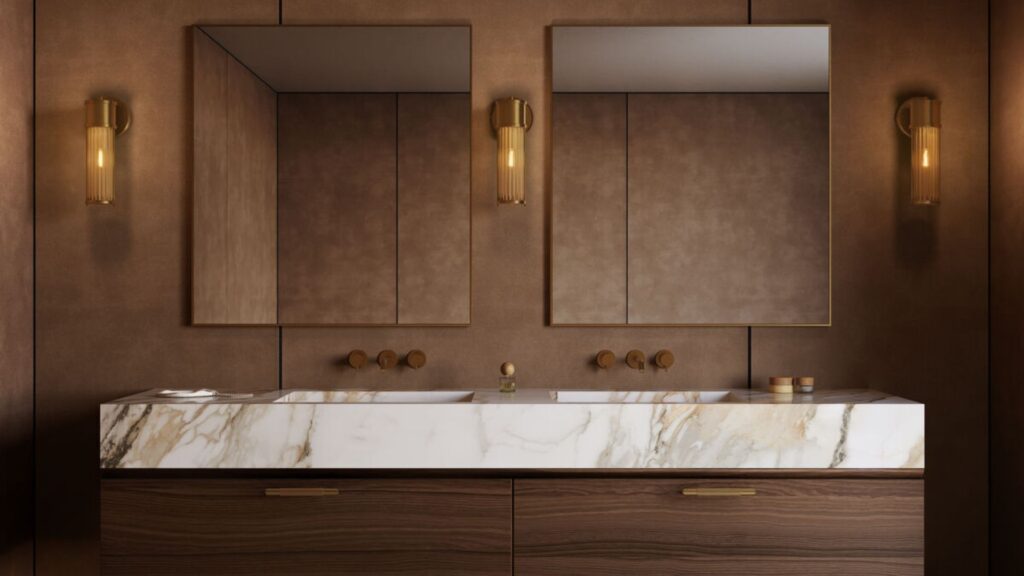
The interior design world has spoken: 2026 is the year of the grounded palette. According to leading designers surveyed by LUXE Interiors + Design, designers an homeowners are moving decisively toward nature-inspired hues — warm terra cottas, earthy greens, oxblood, deep blue, and rich tonal neutrals — layered with natural materials like stone, wood, and woven textiles.
Interior colors are often emotional choices, as people seek hues that make rooms inviting and intentional for the long-term, as well as stylish in the moment. And surfaces, more than almost any other design element, are key to setting the tone.
Here’s how Caesarstone’s two newest product collections — Caesarstone ICON™ advanced fusion surfaces and Caesarstone Porcelain — translate 2026’s most compelling color stories into surface decisions anyone can select today and enjoy for years to come.
Warm + Grounded: Terracotta, Caramel, and Clay
The warm neutral wave is the most consistent signal designers are noting this year. It’s a direct departure from the cool gray that was so popular in the past decade. Homeowners want warmth they can feel and tones that echo natural landscapes rather than technology.
For surfaces, this trend lives in the interplay between the countertop, wall cladding, and floor. Caesarstone’s response:
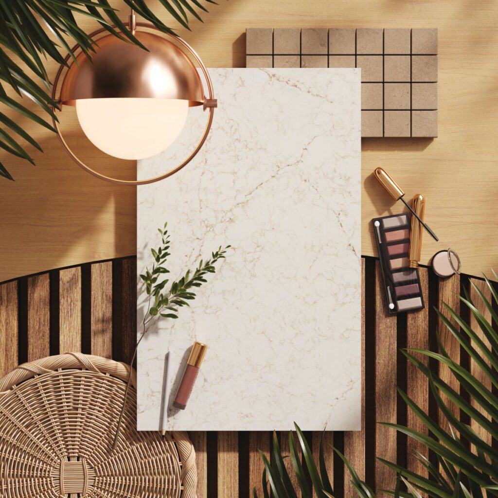
5144 Rossa Nova (Caesarstone ICON): The warm cream stone base with deep terracotta veining offers the the caramel-to-clay depth this palette demands. Pair with natural oak, earth-toned tile, and woven textures for a kitchen or bath that feels undeniably of this moment.
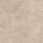
232 Cider Leather (Caesarstone Porcelain 6mm): This rich, leather-textured porcelain in warm amber tones is innately versatile. Floor it, wall-clad it, or face cabinetry in it. The convincing leather texture adds sophisticated, organic dimension that makes this a trend you can feel.
Tonal Spaces: Depth Through a Single Color Family
Tonal design is sophisticated precisely because it requires restraint and precision. When every element — walls, flooring, decor — operates within the same color palette, the material quality of each component becomes the differentiator. Texture, sheen, and finish convey the visual nuances.
This is where Caesarstone’s multi-surface approach becomes a real specification advantage. A single colorway across countertops, backsplash, floor, and cabinet facing creates a cohesive tonal envelope, without the challenge of sourcing across multiple suppliers.
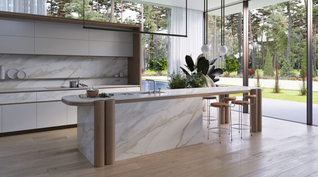
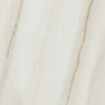
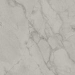
506 Mirabel (Caesarstone Porcelain 6mm, Glossy Bookmatch): Soft white-gray with subtle movement, available in bookmatch. Wrap walls and horizontal surfaces in a single tonal story. The glossy finish adds dimension without straying from core color palette.
543 Marenstone (Caesarstone Porcelain 6– & 12mm): A cool mineral stone tone — earthy gray with warmth underneath. Use floor-to-ceiling for the full effect this trend requires.
230 Creamy Leather (Caesarstone Porcelain 6mm): A softer, lighter take on the look of leather, this pale cream hue offers warm undertones and compelling texture. Use these lean profile panels across multiple surfaces in the same room for a minimalist look that speaks directly to this trend.
Earthy Greens: From Mossy Olive to Soft Celadon
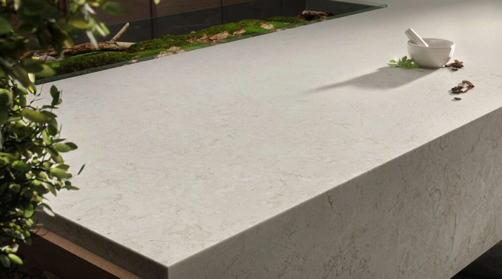
Green is having its most nuanced moment. It’s not the bright botanical green of a few years ago; today’s green hearkens to aged stone, forest floors, and mineral deposits. Think of the shadowed hues of moss and lichen or newly budding spring trees shrouded in morning mist.
Surface-forward green design works best when the stone does the work and the paint plays a supporting role. These selections answer the style:
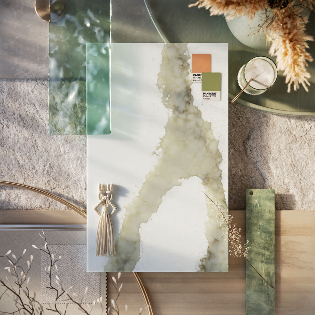
8104 Calacatta Thyme (Caesarstone ICON): Veined in soft sage and hints of gray on a warm cream background, this hue works as the anchor for a green-themed space without going aggressively pigmented.
545 Fossillia (Caesarstone Porcelain 6– & 12mm): With its seafoam base and organic tones, this hue interplays beautifully with lighting and adjacent design elements. It blends in seamlessly whether a space is warm or cool, in a contemporary and classic style.
Moody & Immersive: Dramatic, Deep Tones
The moody space with a drenching of color drama is one of the most confident design moves of 2026. Powder rooms, pantries, primary suites, and dining rooms are becoming focal points that contribute to a home’s overall atmosphere rather than just punctuate it. Surfaces in these immersive spaces provide an anchoring character, not just color.
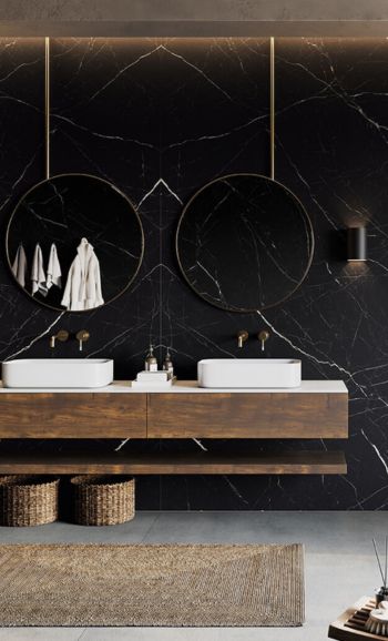
509 Onyxa (Caesarstone Porcelain 6mm, Glossy Bookmatch): This eye-catching stone look available in bookmatch is ideal for wall cladding in a powder room or primary bath to achieve the fully immersive effect designers seek for this trend. The gloss finish amplifies the timeless quality.
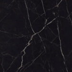
511 Smokestone (Caesarstone Porcelain 6mm, Bookmatch): With its immersive midnight black base and lightning-striks veins of chalky white, this moody hue takes a starring role in any space its featured.The scale of its bookmatched, large-format panels makes a design statement that simply can’t be ignored.
Why Surface Is the Color Decision That Matters Most
Paint and upholstery often get the most attention in color trend coverage, but countertops and surfaces carry the hues that must transcend trends to offer lasting appeal. Regardless what’s popular any given year, the surfaces prove to be the investment that lasts while everything else — decor, textiles, hardware — adjusts around it.
Caesarstone collections offer the palette range and application flexibility to lead with surface. The result is a whole-room surface design approach that’s not only fashion-forward in style but future-proof in terms of performance.
{{ subtitle }}
{{ i.desc }}
{{ subtitle }}
{{ subtitle }}